What is Color Separation and How to Separate Colors for Print
What is Color Separation and How to Separate Colors for Print
Let’s start with a definition of what color separation is and how it’s used by printers. Color Separations are artwork and photographs split into component plates of the four colors cyan, magenta, yellow, and black (CMYK) in preparation for process printing. In graphic arts, cyan, magenta, and yellow are also known as Subtractive Primary Colors because along with black, they are the ink colors used in color-process printing.
On the Molecular web site, they offer an Optical Microscopy Primer under the Physics of Lights and Color section which provides an excellent definition of subtractive primary colors and how they work: “Pigments, and dyes are responsible for most of the color that humans see in the real world. Books, magazines, signs, and billboards are printed with colored inks that create colors through the process of color subtraction. . . . When two of these subtractive primary colors are added together, they produce a primary additive color. For example, adding magenta and cyan together produces the color blue, while adding yellow and magenta produces the color red. In a similar manner, adding yellow and cyan produces green.” In theory, these three subtractive primaries could be used alone, however the limitations of most dyes and pigments makes the addition of black necessary to achieve true color tones.
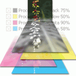
On a printing press, each separated component is made into a film that is used to prepare a printing plate for that color. The final image is created by printing each color plate, one on top of another. Think of layering colored transparencies on top of each other in the specific order of cyan, magenta, yellow, and black. Once a document is on a printing press, each color of ink used in that particular piece is printed one at a time and the final image is created by printing in this sequence. The Molecular web site also offers an interactive Java tutorial where designers can see the process of color separation in action. Try the tutorial at: http://micro.magnet.fsu.edu/primer/java/primarycolors/colorseparation/index.html. A basic understanding of the subtractive color process and how it works can help graphic designers make the best color choices for a specific project.
Besides the color separations for standard four-color process printing, designers also need to be familiar with spot color separations. Just as with process printing, there is a plate on the press for each color of ink. Say for example you have two spot colors, Pantone 239U (sort of purple), Pantone 368U (bright green), and black. This gives you two spot colors plus the black for a total of three color separations and three plates. These same principles of color separation also apply to desktop publishing.
But whether preflighting a document for a traditional press or working on a desktop printer, graphic designers need to be aware of issues that affect a document’s appearance. One of the most common is not making the conversion from the RGB color mode to CMYK whenever a document will be printed. Using the RGB color mode (red, green, and blue) is fine for a web site as they are additive colors, optimized for display on computer monitors or scanning devices. While the color change between the two modes isn’t always substantial, there are instances where RGB and CMYK differ dramatically, so get in the habit of making the conversion before sending files for output.
To make sure those separations are correct, during the prepress stage designers should print color separations on their desktop printer to insure colors will separate properly once sent to a commercial printer. For example, if you have a four-color (CMYK) document that is four pages long, you’d have a total of 16 pages in color separations – four per page.
Another point to consider is what type of file format you’ll be using. If you’re sending a file to your printer as a PDF, a pre-separated or PostScript file contains a separate plate for each file in the document. So for example, a standard process color job submitted as a PDF would have four separate pages (or plates as noted above) containing cyan, magenta, yellow, or black color information. If you use a composite file, all of the color information is held in one file meaning everything is on one page. In this case, your service bureau separates the file into the individual color separations. Both file types have advantages and disadvantages and it’s wise to discuss those with your printer.
This last point is one graphic designer’s should do on every job and can’t be stressed enough. Getting to know your printer and asking questions about a job or for your printer’s suggestions and advice is one of the most important things you can do. Building a relationship with your printer or service bureau is beneficial no matter what the job. In the area of color separations such rapport is crucial, as the wrong color can change everything and not necessarily for the better.

